Artwork mistakes are one of the most common reasons custom POP display projects get delayed. Many buyers focus on structure, cost, and MOQ first, but once the design moves into production, artwork quality becomes just as important. A display can have the right size and the right material, but if the print file is not prepared correctly, the project can still lose time in revision, sampling, and approval.
This guide is written for buyers, brand teams, and importers who want to prepare custom POP display artwork correctly from the start. Instead of treating artwork as the final decorative step, it helps to see it as part of production planning. The cleaner your files are, the faster the factory can move from concept to proof and from proof to production.
Executive Summary
If you want to avoid delays, make sure your POP display artwork includes the correct dieline, bleed, color mode, logo files, text hierarchy, and print-ready file format. Most delays happen because buyers send only visual mockups, low-resolution images, or files without production-ready layout. If your supplier still needs to fix the artwork before making a sample, the project timeline becomes longer and approval gets harder.
Why Artwork Preparation Matters More Than Buyers Expect
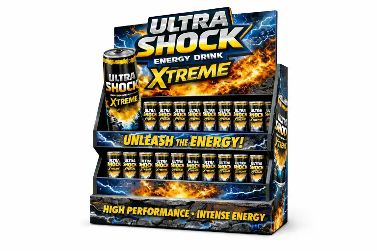
In a custom cardboard display project, structure and graphics must work together. The factory cannot simply “print the design” the same way a digital screen shows it. Artwork has to match folds, cut lines, shelves, headers, side panels, and hidden areas. A strong design on screen can become weak in production if important elements fall into fold lines, if logos sit too close to the edge, or if key messages are split by structure.
This is especially important for promotional displays, where the print design carries much of the selling power. If you are already comparing budget and timeline, our guides on custom cardboard display cost and cardboard display lead time explain how artwork delays can also affect total project efficiency.
What Buyers Should Prepare Before Sending Artwork
| Item | Why It Matters | Common Mistake |
|---|---|---|
| Dieline | Shows cut, fold, glue, and safe areas | Using a mockup without structure lines |
| Vector logos | Keeps branding sharp in print | Sending only PNG or screenshot logos |
| CMYK colors | Improves print accuracy | Sending RGB files only |
| Bleed | Prevents white edges after cutting | Designing to trim line only |
| High-resolution images | Keeps graphics clean | Using web images that are too small |
| Editable file format | Makes revision faster | Sending flattened images only |
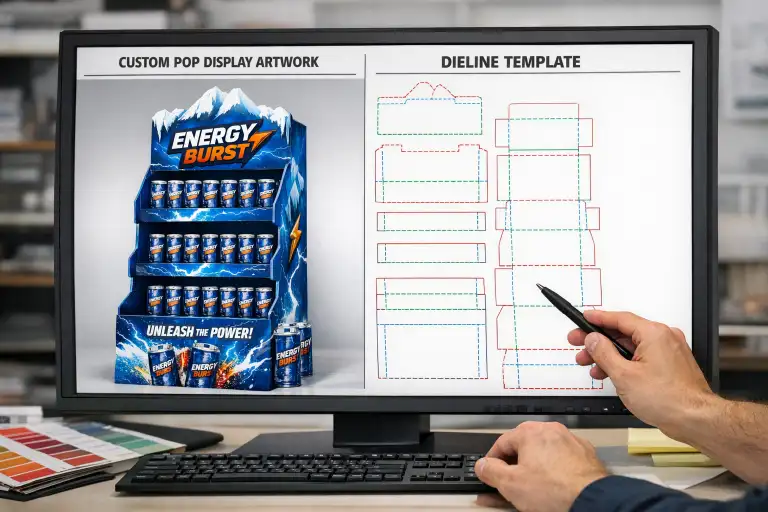
Step 1: Start With the Correct Dieline
The dieline is the production map of the display. It shows cut lines, fold lines, glue areas, safe zones, and often panel naming. Buyers should never place final artwork onto a guessed structure or onto a visual render that does not reflect the production layout. A proper dieline helps the design team understand exactly where each graphic should sit.
If your supplier already developed the structure, ask for the final dieline before placing artwork. If the structure is still under development, do not finalize print artwork too early. Structure changes late in the process often force the artwork team to redo everything.
Step 2: Use Print-Ready File Types
The most useful file types are usually editable vector or layered formats, such as AI, PDF, EPS, or PSD depending on the artwork. Factories often prefer formats that let them check fonts, layers, cut lines, and linked images. Buyers who send only JPG screenshots, flattened mockups, or presentation slides usually create extra back-and-forth because the artwork cannot move directly into production work.
A presentation mockup may still be useful for visual direction, but it should not replace the print-ready file. The production file must always be clearer and more technical than the marketing preview.
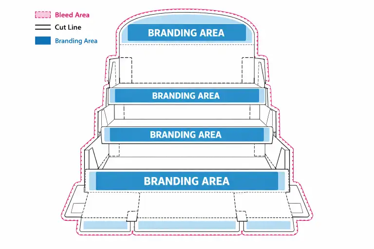
Step 3: Keep Logos, Text, and Claims Away From Risk Areas
One of the most common artwork mistakes is placing logos, flavor names, or promotional claims too close to folds, cuts, tabs, or edges. This often looks fine on a flat screen but performs poorly once the display is assembled. Important information can become hard to read, broken by structure, or partly hidden by product placement.
Good artwork planning means deciding early which messages must stay visible from the main shopper view. Usually this includes brand logo, product type, key visual, and one main message. Not every panel needs equal design weight. Strong displays usually give priority to the shopper-facing surfaces first.
Step 4: Check Color Mode Before Approval
Retail display graphics often use strong colors to attract attention, but screen color and printed color are not the same. Buyers should understand that artwork prepared in RGB may not reproduce exactly the same in offset or other print production. Using CMYK from the beginning usually helps reduce unexpected shifts.
If exact brand color is critical, confirm whether the project needs special color matching before sample approval. This is particularly important for beauty, beverage, and premium packaging projects, where color inconsistency can weaken brand recognition. If you are also choosing surface treatment, our printing and finishing guide can help explain how finish affects visual result.
Step 5: Prepare Images at the Right Resolution
Low-resolution images may still look acceptable in a small on-screen layout, but once printed on a display, they often look soft, pixelated, or unprofessional. This is a common problem when buyers pull pictures from websites, social media, or screenshots instead of original source files.
If the design uses product renders, lifestyle photos, or campaign images, make sure the print source is large enough for the actual display size. A header card or side panel may need much more image detail than buyers expect.
Step 6: Decide Early What the Supplier Can Adjust
Some buyers expect the factory to “fix the file a little” during production. Minor adjustments may be possible, but major artwork correction should not be left to the last minute. If the supplier is expected to move elements, recreate text, rebuild logos, or rework image quality, the project will usually slow down. The better approach is to agree early on what is final and what the supplier may optimize for production.
This becomes even more important when MOQ, budget, and schedule are already tight. You can also compare this with our quote requirements guide, because artwork clarity directly affects how smoothly the project moves after quoting.
Checklist Before You Approve POP Display Artwork
- Does the artwork sit on the correct final dieline?
- Are all logos provided in clear editable format?
- Is the file prepared in CMYK where required?
- Are bleed and safe areas included?
- Are important texts away from fold and cut lines?
- Are all product images high enough in resolution?
- Have all revisions been consolidated into one final version?
What Usually Causes Last-Minute Delays?
Last-minute delays often come from version confusion, incomplete file delivery, or unclear approval responsibility. For example, the brand team may approve a visual mockup while the production team is still missing the real editable file. Or the structure may change after artwork has already been placed. Another common issue is buyers confirming a sample visually without checking whether all carton marks, side panels, and hidden areas are correctly finalized.
In export projects, it is also useful to confirm whether carton markings, handling symbols, or shipping labels need to be included in the broader file package. If shipment planning matters, our export packaging guide explains what buyers should clarify before dispatch.
Useful External References
For buyers new to corrugated display production, it helps to understand both board structure and production standards. The Fibre Box Association overview of corrugated provides useful background on corrugated material. For standardized structural terminology, the FEFCO code reference is also helpful when discussing layout and structure with a supplier.
Conclusion
Preparing artwork for a custom POP display is not only a graphic design task. It is a production task, a timing task, and a quality-control task at the same time. Buyers who prepare clear dielines, editable files, correct color settings, and properly placed branding elements usually move faster from idea to sample and from sample to production.
If you want support preparing artwork for your next project, feel free to contact us with your display concept and files.
FAQ
What file format is best for POP display artwork?
Editable vector or layered production files such as AI, PDF, EPS, or PSD are usually the most practical for custom display work.
Can I send only a mockup or screenshot?
You can send it as a visual reference, but it should not replace the final print-ready file.
Why is bleed important in display artwork?
Bleed helps prevent white edges after cutting and improves print quality at trim boundaries.
Should I prepare files in RGB or CMYK?
CMYK is usually the safer option for print production because it aligns more closely with final printed output.
What is the most common artwork mistake?
Placing key logos or text too close to fold lines, cut lines, or glue areas is one of the most common mistakes.
Can the supplier adjust my file before production?
Minor adjustments may be possible, but major corrections usually slow the project and should be avoided where possible.


One Response