Finding the right partner is tough. A bad one can sink your project, waste money, and cause huge delays. But a great partnership ensures your vision comes to life smoothly.
To partner effectively, start with a detailed brief outlining your product, goals, budget, and timeline. Vet manufacturers by reviewing their portfolio and case studies. Clear, consistent communication is the key to finding a partner who truly understands your brand and can deliver results.

Choosing a manufacturer is one of the most important decisions you'll make for your product's retail launch. It's about more than just finding the lowest price. It’s about finding a team that becomes an extension of your own. A good partner will ask the right questions, challenge your ideas to make them better, and guide you through the process from a simple sketch to a store-ready display. Over my 16 years in this business, I've seen firsthand how a strong collaboration can turn a good display into a sales-driving machine. Let's walk through how to build that kind of successful partnership.
How to make your design pop?
Your display design1 looks okay, but it doesn't grab attention. It gets lost in the noisy retail environment, failing to attract customers and drive sales for your product.
To make your POP display design1 truly "pop," you need to focus on a unique structural shape, bold color psychology2, and clear, simple messaging. These three elements work together to capture shopper attention from across the aisle and make your product stand out from competitors.

Making a design "pop" is a challenge I've helped designers like you solve for years. It's not about adding more noise; it's about being smarter with your design choices3. A common mistake is trying to say everything at once, which just creates visual clutter. The goal is to interrupt a shopper's journey with something they can't ignore. This interruption comes from a combination of structure, color, and words. I remember a project for a beverage company where we changed the display from a standard rectangle to an angled, dynamic shape. That simple structural change, combined with a high-contrast color scheme4, increased their sales by almost 30% in test stores. It's proof that smart design has a real impact.
Break it Down: The Three Pillars of "Pop"
To create a show-stopping display, you need to master three key areas. Each one plays a critical role in how customers see and interact with your product.
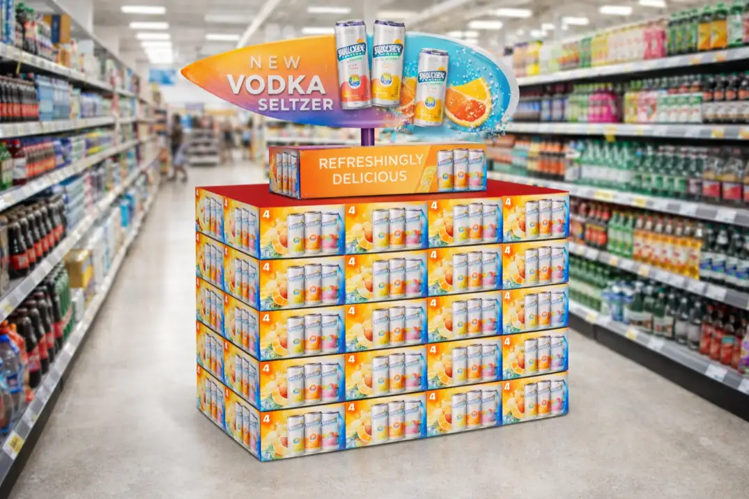
- Structural Innovation: Don't just settle for a box. Think about the product's story. Is it a luxury item? Maybe a clean, elegant structure works best. Is it a fun, energetic snack? Use angles, curves, and tiers to create a sense of motion. The physical shape is the first thing people notice from a distance.
- Color and Graphics: Color creates emotion. Use a color palette that aligns with your brand but also contrasts with the typical store environment. Graphics should be large, clean, and support a single, primary message. Avoid small text that's unreadable from five feet away.
- Clear Hierarchy: Your display needs to communicate in a specific order. The main headline or brand logo should be visible first, followed by the product, and then any secondary information like price or features.
Here is a simple table to guide your thinking:
| Element | Weak Design (Gets Ignored) | Strong Design (Pops) |
|---|---|---|
| Structure | Standard rectangular shelf | Custom shape, multi-tiered |
| Color | Muted, low-contrast palette | Bold, high-contrast, on-brand |
| Messaging | Multiple small fonts, cluttered text | One large headline, minimal text |
How to make a pop display?
You have a great product but need a physical display to get it into stores. The process seems complicated, from design to production, and you're worried about getting it right.
Making a POP display involves three core stages: design, prototyping5, and production. You start by designing the structure and graphics, then create a physical prototype to test and approve before manufacturing the final quantity.

When I first started, the process of creating a display from scratch felt like magic. Now, after making thousands of them, I can tell you it's a very clear, step-by-step process. But skipping a step is where things go wrong. The most critical part, and one that many people rush, is prototyping5. I had a client who was certain their design was perfect. They wanted to skip the prototype to save time. I insisted we make one. When we loaded it with their actual product, the shelves started to sag. That simple prototype saved them from a disastrous production run of 1,000 faulty displays. It’s a small step that prevents huge headaches.
The A-to-Z Production Journey
Let's walk through the exact steps my team and I take to bring a display from an idea to the retail floor. Understanding this process will help you collaborate with any manufacturer more effectively.
Stage 1: The Brief and Initial Design
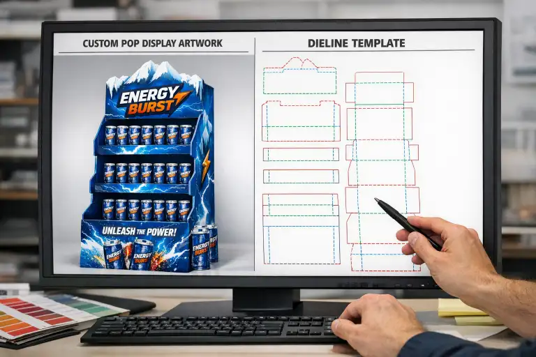
It all begins with your idea. A good manufacturer will work with you to create a detailed brief6. What product are you displaying? How many units should it hold? What is the budget? Where will it be used? Our designers then take this information and create a 3D rendering and a die-line, which is the flat template for the structure.
Stage 2: Prototyping and Refinement
This is where the design becomes real. We create a full-size, unprinted (white) sample to test the structure and a full-color printed sample to check the graphics. This is your chance to see it, touch it, and test it with your products. We check for stability, ease of assembly, and overall visual impact. We make any necessary adjustments during this stage.
Stage 3: Mass Production and Logistics
Once you approve the final prototype, we move to full production. This involves printing the graphics onto large cardboard sheets, die-cutting the shapes, and preparing them for shipment. Most displays are shipped flat to save on costs and prevent damage. We also include a clear instruction sheet to make assembly easy for the team in the store.
What is the best way to display funko pops?
You’re designing for collectible items7 like Funko Pops. Collectors are picky, and standard displays risk damaging the boxes or hiding the products, making them less appealing.
The best way to display Funko Pops is using a tiered counter display8 or a floor stand with separate compartments. This keeps the boxes in mint condition, ensures every Pop is visible, and creates an organized, attractive presentation for serious collectors.

Displaying collectibles is a special challenge. The packaging is just as important as the product itself. For Funko Pop collectors, a crushed corner or a scuffed box is a deal-breaker. So, the display must protect the product above all else. I worked with a comic book store that was just stacking their Pops on a shelf. They were constantly falling over, and browsing was a nightmare. We designed a simple, tiered cardboard riser that fit perfectly on their existing shelves. It instantly made the section look more professional, and because customers could see every single character clearly, sales of older stock picked up immediately. For high-value items, the display has to show you care.
Designing for the Collector's Eye
When you're dealing with products like Funko Pops, you're not just selling a toy; you're selling a collectible. The display has to respect that. Here are the key factors to consider.
- Protect the Box: The structure must prevent the boxes from getting crushed or dented. This means designing pockets or shelves with the exact dimensions of the Funko Pop box in mind. There should be enough room to easily take one out without damaging others.
- Maximize Visibility: Collectors are hunting for specific characters, including rare "Chase" variants. A good display ensures no box is hidden behind another. Tiered designs are excellent for this, as they elevate the back rows.
- Encourage Browsing: The display should make it easy and inviting for a customer to look through the selection. A messy, disorganized pile is intimidating. An organized grid is shoppable.
Here’s a comparison of common display types for a product like Funko Pops:
| Display Type | Pros | Cons | Best For: |
|---|---|---|---|
| Tiered Counter Display | Great visibility, compact, protects boxes. | Holds fewer units, takes up counter space. | Point of sale, new releases. |
| Floor Display (PDQ) | High capacity, big brand impact, shoppable. | Larger footprint, more expensive to produce. | Feature promotions, high-traffic areas. |
| Standard Shelving | Cheap and easy. | Poor visibility, high risk of damage. | Not recommended for collectibles. |
You need a pop-up banner for a trade show or event. A poorly designed banner gets ignored, meaning you've wasted your money and a valuable opportunity to attract customers.
To design a great pop-up banner, place your logo and main headline at the top, use a single, powerful image in the center, and put your website or call-to-action10 at the bottom. Keep the message simple and clear.

While my main business is cardboard displays, a lot of our clients need other marketing materials for their campaigns, like banners. The principles of good design are the same: you have only a few seconds to get your message across. A banner is often seen in a busy, crowded environment like a trade show. People are walking by quickly. They aren't going to stop and read a paragraph of text. Your design has to work like a billboard. I always tell my clients to think about the "three-second rule." Can someone understand who you are and what you do in the three seconds it takes them to walk past your booth? If not, the design isn't working.
The Anatomy of a High-Impact Banner
A banner's job is to grab attention from a distance and deliver a message quickly. To do this, you need to use a clear visual hierarchy11. This means organizing your information into zones based on how people naturally read a vertical design: top, middle, and bottom.
Top Zone: Your Identity
This is the first place people look. It should be at eye level or above. Put your company logo and your main headline here. The headline should be short (5-7 words) and state a key benefit. For example, instead of "We Sell Innovative Cardboard Displays," use "Make Your Product Stand Out."
Middle Zone: The Hook
This is your biggest visual area. Use one large, high-quality image or a very simple graphic that shows your product or a positive outcome. This is what will draw the eye from across the room. Avoid using lots of small pictures; it just looks cluttered.
Bottom Zone: The Action
This is where you tell people what to do next. Include your website, social media handle, or a simple call to action like "Visit Us at Booth 123." Keep this information clean and easy to read.
Here’s a simple layout guide:
| Banner Section | Content | Purpose |
|---|---|---|
| Top Third | Logo + Main Headline | Grab attention and identify your brand. |
| Middle Third | One large, powerful image | Create an emotional connection, show the product. |
| Bottom Third | Website / QR Code / Booth Number | Tell the viewer what to do next. |
Conclusion
Finding the right manufacturer is a partnership. With a clear design, a solid process, and good communication, your custom POP display will capture attention and drive real sales for your brand.
-
Learn the essential components that make display designs effective and appealing. ↩ ↩
-
Learn how color influences purchasing decisions and how to apply it in your designs. ↩
-
Learn how to make informed design choices that resonate with your target audience. ↩
-
Understanding high-contrast color schemes can help your designs stand out in crowded environments. ↩
-
Discover why prototyping is a crucial step in the design process to avoid costly mistakes. ↩ ↩
-
Understanding how to create a detailed brief can streamline your project and ensure all stakeholders are aligned. ↩
-
Learn the best practices for displaying collectibles to attract and engage customers. ↩
-
Explore how tiered displays can enhance visibility and sales for your products. ↩
-
Discover key design elements that make pop-up banners stand out at events. ↩
-
Learn how a strong call-to-action can drive customer engagement and conversions. ↩
-
Explore the concept of visual hierarchy to improve the effectiveness of your marketing materials. ↩

2 Responses