Are your products getting lost on crowded shelves? You spend a fortune on marketing, yet sales barely move. It’s frustrating when a great product goes unnoticed right at the finish line.
Your promotions are likely failing because they lack visual impact at the critical point of decision. Effective Point of Purchase (POP) displays grab attention, communicate value, and trigger impulse buys precisely where customers shop, turning overlooked items into must-have purchases.

I’ve been in the commercial display industry for over 16 years, and I’ve seen this story play out time and time again. A brand will have an amazing product, a solid marketing campaign, but they forget the last, most important three feet of the sales journey: the retail floor. That's where the final decision is made. A great product can fail simply because it didn’t stand out. Let’s break down how to fix that and make sure your promotions not only work but excel.
How do POP Displays Actually Capture Customer Attention?
Your product is one of thousands in a busy store. How do you make someone stop and look? It feels like an impossible task when shoppers are rushing past, focused on their lists.
A well-designed POP display acts like a visual magnet. It uses bold graphics, unique shapes, and strategic placement to disrupt the monotonous pattern of retail shelving. This break in the visual flow naturally draws the human eye, making your product essentially impossible to ignore.

To truly grab a shopper's attention, you have to think like them. They are on a mission, often overwhelmed by choices. A custom cardboard display needs to cut through that noise in seconds. I've learned that this comes down to two critical elements: psychological triggers and smart placement.
The Psychology of Design
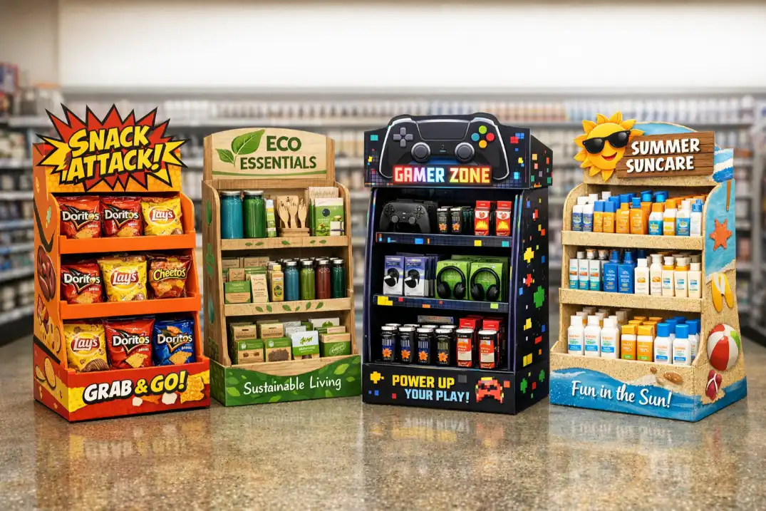
First, let's talk about the visual hooks. Color is a powerful tool. Bright, contrasting colors like red and yellow can create a sense of urgency, while blues and greens can convey trust and nature. It’s not just about being loud; it’s about using the right colors to match your brand and message. Shape is another secret weapon. While most shelves are rectangular, a display shaped like your product or a related icon immediately stands out. I once worked with a beverage company to create a floor standing display unit that looked like a giant straw in a cup. It was fun, memorable, and shoppers couldn't help but walk over to see what it was.
The Power of Placement
Second, where you put the display is just as important as how it looks.
| Display Location | Customer Mindset | Effectiveness |
|---|---|---|
| End Caps | Actively looking for deals and new items. | Very High |
| Checkout Counter | Waiting, prone to impulse buys. | High |
| Main Aisles | Focused on their shopping list. | Medium |
| Store Entrance | Just beginning their trip, goal-oriented. | Low to Medium |
Placing a display at the end of a high-traffic aisle (an end cap) guarantees visibility. Similarly, small counter display units right by the cash register are perfect for small, impulse-buy items. It’s about catching the customer at the right time and in the right mindset.
Can Affordable Cardboard Displays Really Be That Effective?
You might think that a truly effective display has to be made of expensive, permanent materials. You worry that a cardboard solution will look cheap and hurt your brand image, or won't deliver a good return.
Absolutely. Modern corrugated cardboard displays are incredibly versatile, strong, and cost-effective. Their low price point means you can launch targeted, seasonal, or short-term campaigns without a huge financial risk. This allows you to test offers and refresh your marketing presence often, delivering a massive ROI.

Over my 16 years in this business, the biggest misconception I've had to overcome is the idea that "cardboard" means "flimsy." The technology behind corrugated material has come so far. We can now engineer pallet displays that can hold hundreds of pounds, yet they are light enough to be shipped flat and assembled in minutes. This blend of strength and efficiency is a game-changer.
Cost vs. Impact
Let’s be direct about the return on investment. A permanent metal or acrylic display can cost thousands of dollars and takes weeks to produce. A custom cardboard display costs a fraction of that. This means you can place displays in more stores for the same budget, multiplying your reach. Or, you can run four different seasonal campaigns for the price of one permanent fixture. Since these displays directly lead to purchases at the point of sale, the ROI is not just high; it's immediate and easy to measure.
Sustainability Sells
Today's consumers care about the environment. Using recyclable and eco-friendly cardboard for your displays sends a powerful message about your brand's values. It shows you're responsible. I've seen brands gain loyal customers simply because they made a visible commitment to sustainability. It's no longer just a "nice-to-have"; it's a core part of your brand image.
| Feature | Cardboard Displays | Permanent (Metal/Plastic) Displays |
|---|---|---|
| Initial Cost | Low | High |
| Customization | Extremely High (any shape/print) | Limited |
| Lead Time | Fast (1-3 weeks) | Slow (6-10 weeks) |
| Eco-Friendly | Yes (recyclable, biodegradable) | No |
| Best For | Short-term/seasonal promotions | Long-term brand fixtures |
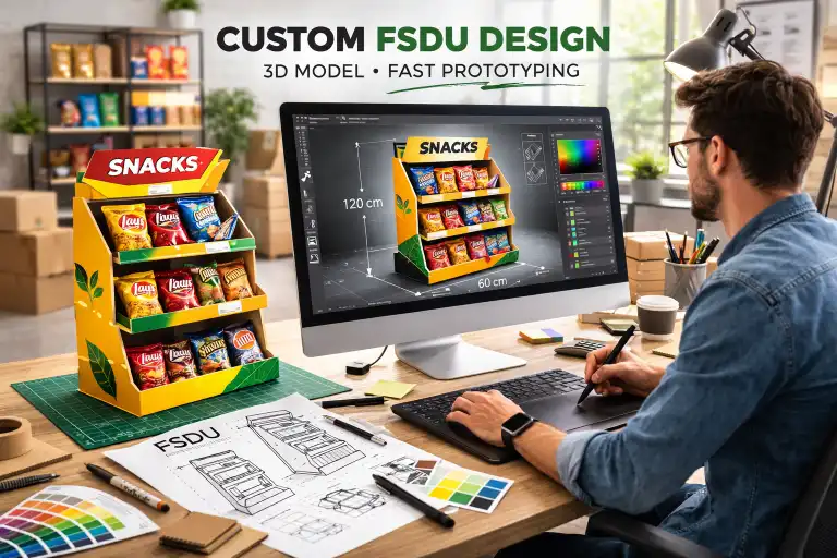
What Makes a POP Display Design Successful?
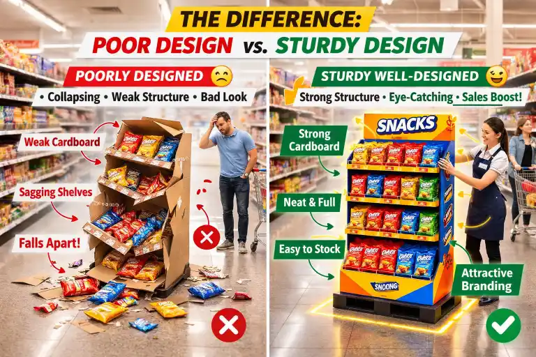
You've decided to use a POP display, but how do you ensure it works? A poorly designed display is just expensive clutter. It can confuse customers, fall apart, or be impossible for store staff to assemble.
A successful design is built on a simple foundation: clarity, product focus, and structural reliability. It must communicate a single, compelling message in under three seconds. The hero should always be the product, not the display itself. And it has to be sturdy and easy to build.

I've learned that great design is a balancing act between creativity and practicality. It’s easy to get carried away with a wild idea, but if it doesn't function in a real retail environment, it has failed. I always guide my clients back to three core principles.
The "Three-Second Rule"
A shopper walking down an aisle gives you about three seconds of their attention. Your display must work within that window. This means a clear visual hierarchy.
- Headline/Offer: The biggest and boldest text. "50% Off" or "New Flavor!"
- Product: The product itself must be clearly visible and accessible.
- Brand: Your logo should be prominent but not overpowering.
Anything more than that is noise. Keep it simple, scannable, and focused on one key takeaway.
Structural Integrity is Non-Negotiable
I once saw a competitor's display for a canned drink collapse in a store. Cans rolled everywhere. It was a mess, but worse, it was a disaster for the brand's image. A flimsy display screams "cheap product." We design for the real world. That means understanding how much weight the display needs to hold and engineering the internal structure to support it. We also consider factors like humidity and foot traffic. A display that stands strong for the entire promotion reflects the quality of the product it holds.
Design for the Person Building It
Your amazing design is useless if a store employee can't figure out how to assemble it. We always design with assembly in mind. This means creating intuitive, interlocking parts that require no tools or glue. We also provide simple, visual instruction sheets. A design that goes from a flat box to a fully stocked dump bin display in under five minutes is a design that will actually make it onto the sales floor.
Conclusion
In-store promotions succeed when they grab attention effectively. Well-designed, strategically placed, and affordable POP displays are the key to turning shoppers into buyers right where it counts the most.