Your product is amazing, but it's lost on crowded shelves. Retailers struggle to stock it, and customers ignore it. Master retail-ready packaging to finally get noticed.
Successful retail-ready packaging is easy for staff to identify, open, and shelve. It must also be simple for customers to shop from, strong enough for transit, and easy to dispose of. It perfectly balances branding, practicality, and cost-effectiveness for maximum retail impact.

I've spent 16 years in this industry, and I've seen brilliant products fail because of poor packaging. It’s not just a box; it's your first handshake with the retailer and the customer. The details matter more than you think. So, where do we start? Let's break down the essential elements that will make your packaging work for you, not against you.
Is Your Packaging Instantly Recognizable on the Shelf?
Your packaging looks like every other brown box in the stockroom. Retailers can't find it quickly, and your branding is invisible. Make your RRP a beacon for your brand.
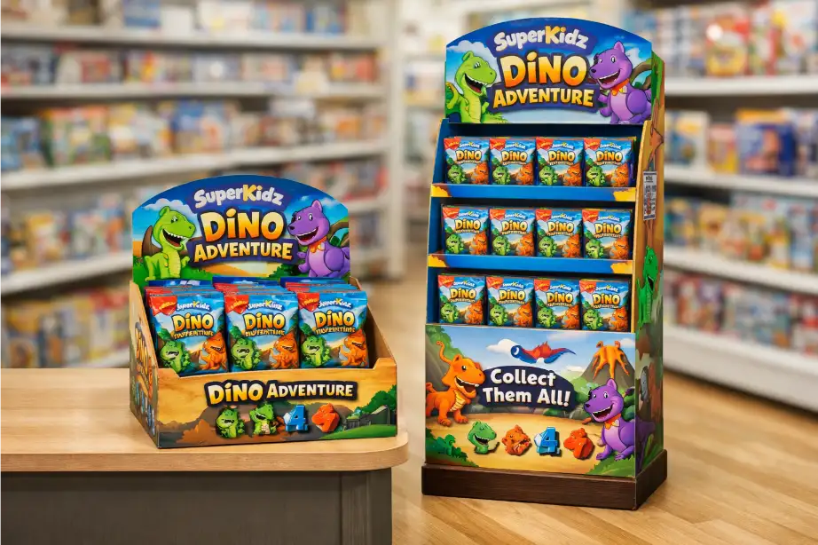
To be instantly recognizable, your packaging needs clear, bold branding and product information visible from multiple sides. Use your brand colors, logo, and simple graphics so retail staff can spot it in the stockroom and place it correctly on the shelf without any confusion.

In my experience, you are designing for two completely different audiences: the backroom retail employee and the in-aisle customer. Your RRP has to speak to both. For the employee, it’s all about speed and clarity. They need to glance at a pallet and immediately find your product. This is where strong, simple graphics and product identifiers on at least two sides of the shipping case become critical. I remember a client whose sales improved simply because we added a large, color-coded icon to their case. Store staff could spot it from across the stockroom. For the customer, the part of the packaging that remains on the shelf—the tray—must act as a mini-billboard. This is where your beautiful product branding shines. It must be eye-catching and communicate your product's value proposition instantly.
Design Focus for Different Audiences
| Audience | Key Design Elements | Goal |
|---|---|---|
| Retail Staff | Clear product name, variant, and case count. Bold, simple graphics. | Quick identification and error-free stocking. |
| Customers | Vibrant brand colors, engaging logo, benefit-oriented text. | Attract attention and encourage purchase. |
Can Retail Staff Open and Stock It in Seconds?
Retail staff waste time wrestling with your packaging. They often use box cutters, risking damage to your products inside. Design intuitive, tool-free packaging they will love to stock.
The best RRP uses easy-to-understand perforations, tear strips, and clear instructions. The goal is a "one-touch" opening that allows staff to place the unit directly on the shelf in under a minute. This efficiency is what retailers value most, leading to better placement.

From a designer and manufacturer's standpoint, this is where engineering meets psychology. The perforations have to be perfect. Too strong, and the box won’t open cleanly, leaving a jagged, unprofessional edge on the shelf. Too weak, and the case can fall apart during shipping, leading to damaged goods. We've all seen it. As a designer like Peter knows, this is a delicate balance. We once worked on a project where the client insisted on a very complex opening mechanism. In testing, we found it took staff nearly two minutes to open, and they often tore it incorrectly. We simplified it to a single, well-placed tear strip with a printed arrow. The feedback from retailers was immediate and positive. Your custom cardboard displays must prioritize this frustration-free experience. The easier you make their job, the better they will treat your product.
Common Opening Mechanisms: Pros and Cons
| Mechanism | Pros | Cons |
|---|---|---|
| Perforated Top | Clean opening, leaves a neat tray. | Can be hard to start without a 'push here' point. |
| Tear Strip | Very fast and intuitive. | Can tear unevenly if the material or design is poor. |
| Interlocking Flaps | No tools required, reusable. | Can be less secure for heavy items during transit. |
Does Your RRP Make Shopping Effortless for Customers?
Your packaging hides your products. Customers struggle to see what's inside or grab an item easily. A frustrating experience means they’ll simply choose a competitor’s product instead.
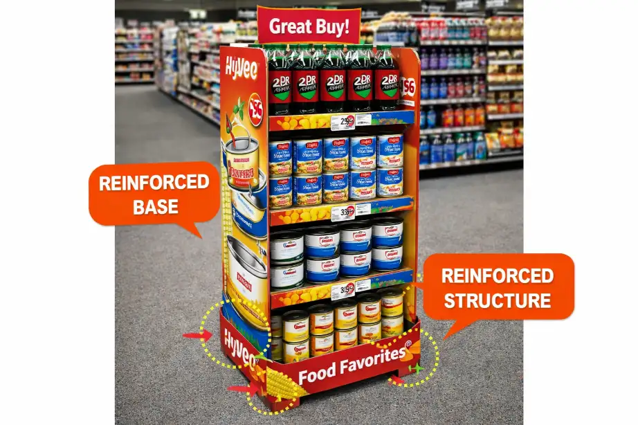
An effective RRP presents products clearly, allowing customers to see the item and its benefits. It should provide easy access for them to take one without disturbing the display. A low front lip and a stable structure are key to maintaining a tidy and shoppable presentation.

Once the RRP is on the shelf, its job is to sell. This means the structural design must serve the product. I always tell my team to think about the customer's hand. Can they easily reach in and grab one item? If products are packed too tightly or the front wall of the tray is too high, customers will hesitate or, worse, make a mess trying to get one out. This is especially true for counter display boxes, where accessibility is everything. The tray should also be strong enough to hold its shape even when half-empty. A collapsing, messy display suggests the product is unpopular or of low quality. The goal is to create a "waterfall" effect, where the next product is always presented perfectly after one is taken. A slightly angled base inside the tray can work wonders for this.
Key Features for a Shopper-Friendly RRP
| Feature | Purpose | Design Tip |
|---|---|---|
| Low Front Lip | Provides maximum product visibility. | Keep it below 1 inch (2.5cm) if possible. |
| Stable Structure | Prevents the display from collapsing as it empties. | Use reinforced corners or a double-wall back. |
| Easy Access | Allows customers to grab one item without effort. | Ensure adequate space between products. |
Is Your Packaging Both Strong and Sustainable?
Your packaging looks great but gets crushed in transit. This leads to damaged products, returns, and unhappy retailers. You need a design that is both tough and eco-friendly.
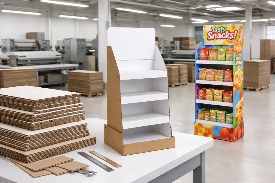
The ideal RRP uses structurally sound corrugated cardboard to protect products throughout the supply chain. At the same time, it should be made from recyclable materials and use minimal ink and glue. This meets both logistical needs and the growing consumer demand for sustainable practices.

This is a huge challenge, but also a huge opportunity. As a manufacturer, I know that material choice is everything. You need a board grade that can withstand the entire journey from our factory to the customer's cart. This means thinking about stacking strength, humidity, and rough handling. For most RRP, a B-flute or E-flute corrugated board offers a great balance of strength and a smooth surface for printing. But strength can't come at the expense of sustainability anymore. Today, brands are judged on their environmental impact. This is why we focus on using recycled content and water-based inks. The "Easy to Dispose" rule is key. The entire RRP unit should ideally be a single piece of material that can be flattened and recycled easily. Avoid plastic windows or mixed materials that complicate disposal for the retailer. Your cardboard display stands can be a powerful statement of your brand's commitment to the planet.
Material Choices: Strength vs. Sustainability
| Material Aspect | Focus on Strength | Focus on Sustainability |
|---|---|---|
| Board Type | B-Flute, Double-wall corrugated. | E-Flute, single-wall with high recycled content. |
| Inks & Coatings | Lamination for durability. | Water-based or soy-based inks, no coating. |
| Construction | Use of staples or strong adhesives. | Interlocking tabs, minimal water-based glue. |
How Do You Balance Cost with High-Impact Design?
You want an amazing design, but the costs are skyrocketing. A tight budget forces you to cut corners, weakening your brand's impact. Smart design choices deliver impact without breaking the bank.
Balancing cost and impact involves strategic design. Use one or two-color printing effectively, optimize the structure to use less material, and design for efficient die-cutting. Clever engineering can create a premium feel without the premium price tag, maximizing your return on investment.

As a business owner, I'm constantly thinking about the bottom line, for my clients and for myself. This is the conversation I have most often with designers like Peter. A full-color, litho-laminated RRP is beautiful, but it's not always necessary or affordable. Often, a well-executed two-color flexo print job on a kraft or white board can have more impact and feel more authentic. The key is to be clever. Can you design the structure to be cut from the sheet with minimal waste? Can a simple die-cut shape in the tray create a premium feel without adding another process? These small decisions add up. I always push for investing in the structural design first. A clever structure that performs all its functions perfectly is worth more than a pretty box that fails. It's about finding that sweet spot where the design is effective, manufacturable, and affordable. That's the real art of what we do at Lddisplay.
Cost-Saving Strategies in RRP Design
| Strategy | How It Saves Money | Potential Trade-off |
|---|---|---|
| Flexographic Printing | Lower cost for large runs, especially with fewer colors. | Lower resolution than lithography. |
| Optimize Die-Line | Nests the design to create less material waste per sheet. | May slightly constrain creative shapes. |
| Standard Board Grade | Using common, in-stock materials avoids custom order fees. | Less unique texture or finish. |
| Structural Design | Using folds and tabs instead of glue or tape. | Requires more design time upfront. |
Conclusion
Successful RRP is a win-win. It makes life easier for retailers, creates a better experience for shoppers, and ultimately drives more sales for your brand.