Designing a cardboard display for small products is not just about making the structure look attractive. A successful display needs to fit the product, work in the available retail space, and make it easier for shoppers to notice, understand, and buy. For small items in particular, display design plays a major role because products can easily get lost on crowded shelves if the presentation is not clear.
Whether you are selling cosmetics, snacks, accessories, electronics, stationery, or other lightweight packaged goods, the right cardboard display can improve visibility and create a stronger in-store presence. If you want to explore different styles first, you can browse our full range of cardboard display solutions.
Start with the product, not the display
The first step in designing any retail display is understanding the product itself. Small products may seem easy to display, but they often create more design challenges than larger items. Their packaging may be too light, too narrow, or too visually weak to stand out without support.
Before choosing a structure, ask these questions:
- What are the product dimensions?
- How much does each unit weigh?
- Does it stand, lie flat, or need to hang?
- How many SKUs need to be shown at once?
- Will shoppers pick up one unit at a time or compare several options?
These details affect shelf depth, hook spacing, tray height, load-bearing design, and graphic layout. A display that works for candy boxes may not work well for cables, lip balms, or sachets, even if all of them are technically “small products.”
Choose the right display type
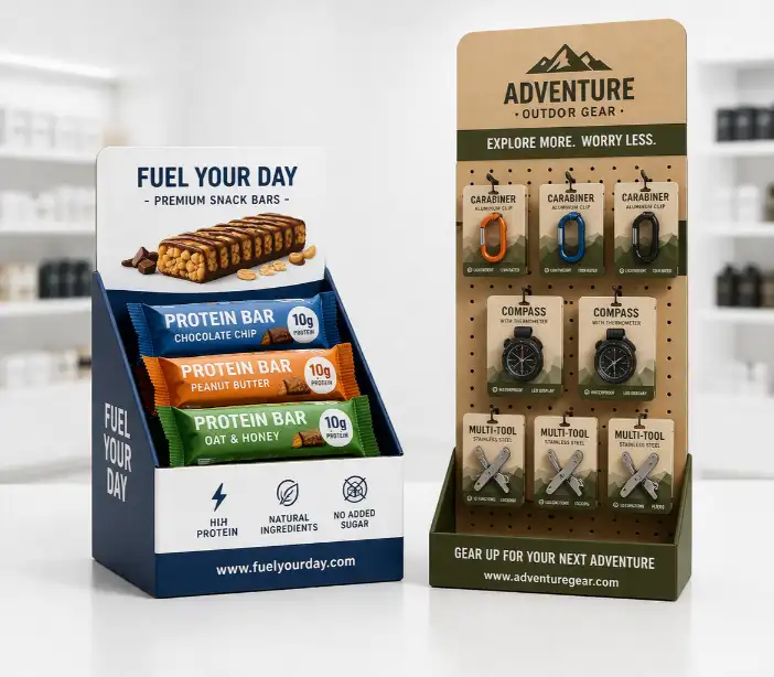
Not every small product needs the same structure. The display type should match how the product is packed and how it will be purchased in-store.
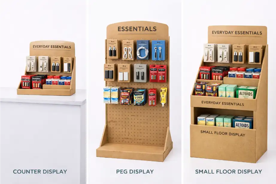
| Display Type | Best For | Main Advantage |
|---|---|---|
| Counter Display | Impulse items, travel-size packs, mini cosmetics, snacks | Strong checkout visibility |
| Peg Display | Accessories, cables, stationery, lightweight hanging items | Neat SKU organization |
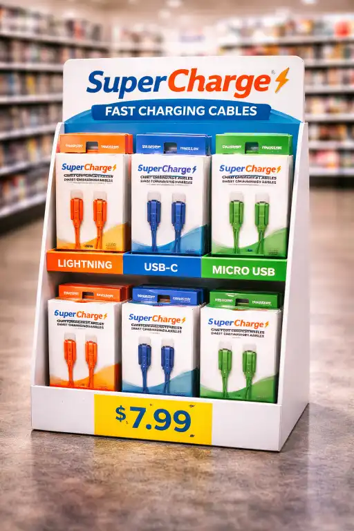
| Small Floor Display | Multi-SKU programs, promotional bundles, seasonal launches | Higher stock capacity |
If your products are intended for checkout counters or compact spaces, a counter display may be the best choice. If your products use hang tabs or need clearer SKU separation, a peg display is often more effective. For wider retail promotions, a compact floor display may work better.
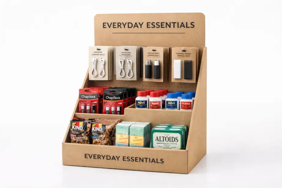
Keep the footprint small but the message clear
For small products, the display should not feel crowded. One common mistake is trying to fit too many items into a compact structure. This often makes the display look messy and weakens product visibility.
A better approach is to keep the footprint efficient while making the layout easy to understand. Products should be grouped logically, and the shopper should immediately see what the product is, why it matters, and where to pick it up.
Good small-product displays usually include:
- clear front-facing product visibility
- simple category or SKU grouping
- enough empty space to avoid visual clutter
- a strong brand message at eye level
- easy product access for quick shopping
Design around shopper behavior
The display should match how people shop in that retail environment. Small products are often purchased quickly, especially in convenience stores, supermarkets, and checkout zones. That means the structure has to support fast decisions.
If the display is meant for impulse buying, the design should be simple and direct. If it is meant for browsing several SKUs, the design should focus on organization and comparison. In both cases, the customer should not need to “figure out” how the display works.
Think about where the display will be placed. A countertop unit may need a bold front panel and a compact base. A peg display may need a strong header card and clear product spacing. A small floor display may need more stock capacity and stronger side-panel branding.
Use graphics to support the product, not overpower it
With small products, graphics are especially important because the packaging itself may not be visible from a distance. The display should help shoppers notice the category and understand the value of the product within seconds.
That does not mean the display should be overloaded with text. In most cases, the best graphic design uses a clear logo, a short product message, consistent brand colors, and clean product-focused visuals. If too many elements compete for attention, the display can feel confusing instead of effective.
Good display graphics often include:
- a clear logo or brand name
- one main product message
- high-contrast product imagery
- color coding for different variants
- pricing or promotional callouts when needed
For tailored structures and branding, many buyers choose a custom cardboard display instead of adapting a generic layout.
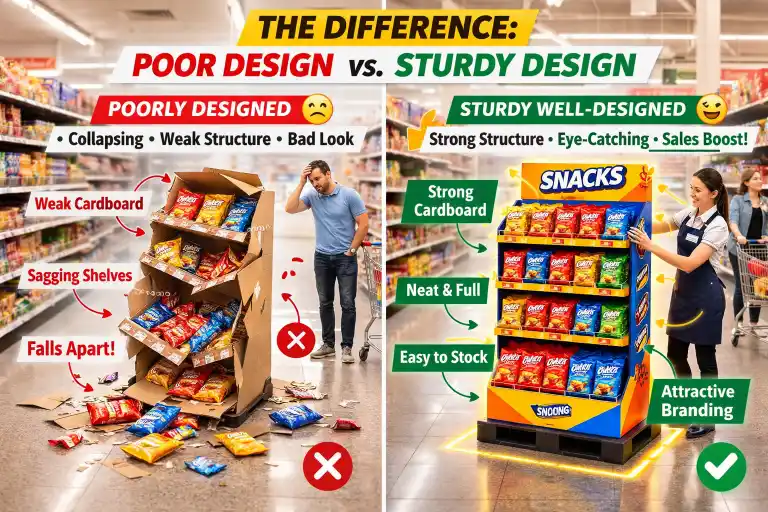
Make sure the structure is strong enough
Even lightweight products need a stable display. Small items are often stocked in larger quantities, which means total weight can build up quickly. A display with weak shelves, poor locking tabs, or unstable footing may collapse or look worn too early in the campaign.
Structural design should consider:
- total product load per shelf or hook
- corrugated board grade
- shelf angle and depth
- reinforced areas for repeated refilling
- base stability during transport and in-store use
The goal is not just to hold the products on day one. The display should still look clean and strong after repeated handling by store staff and shoppers.
Plan for shipping and assembly
A good display design should also work well after it leaves the factory. For retail programs, flat packing is often important because it reduces shipping volume and storage space. At the same time, the structure must be easy to assemble in-store.
If assembly takes too long or feels complicated, retail staff may set it up incorrectly, which can hurt both appearance and performance. This is why many brands simplify the design with pre-glued parts, clear locking systems, and straightforward instructions.
Test before mass production
Before moving into full production, it is smart to test a sample. A sample helps confirm the structure, printing, product fit, and assembly steps before the final rollout. This is especially important for small products because tiny spacing or sizing errors can affect how the entire display looks.
A sample can help you check:
- whether products fit securely
- whether graphics align correctly
- whether the display is easy to assemble
- whether the load-bearing design is strong enough
- whether the finished display looks clean in a real retail setting
If you want to review this step in more detail, visit our sampling page.
Common mistakes to avoid
Some display projects fail not because the idea is bad, but because the design overlooks basic retail realities. Common mistakes include making the header too small, placing too many products in one area, ignoring refill access, or using a structure that does not match the packaging format.
Another common issue is treating all small products the same. A display for mini skincare bottles should not be designed in the same way as a display for phone cables or snack sachets. Each product type needs its own balance of visibility, capacity, and accessibility.
Final thoughts
Designing a cardboard display for small products requires more than a nice shape and printed branding. The best results come from combining structure, product fit, shopper behavior, and clear visual communication.
When the design is done well, even very small products can achieve strong retail impact. Whether you need a counter display, a peg display, or a more fully custom cardboard display, the right structure can help your products stay organized, visible, and easier to sell.