Are you fighting for attention in a crowded store? Your product gets lost on the shelf. A smart cardboard display can make your brand the main attraction.
Cardboard displays maximize brand exposure with strategic placement, bold graphics, and unique shapes. They are your silent salespeople. They grab customer attention, tell your brand story, and drive impulse buys right at the point of sale, making your product impossible to ignore.

I have been in the cardboard display industry for over 16 years. I’ve seen great products fail because they never got noticed. On the other hand, I’ve seen brands completely transform their sales with a simple, well-thought-out display. It’s about more than just a pretty box. It requires a smart plan to connect with shoppers.
Let’s dive into the practical steps you can take to make these displays work harder for your brand.
How can visual design make your cardboard display stand out?
Is your display getting lost on the busy shop floor? Bland designs are easily ignored. You need strong visual elements to catch a customer's eye and make an impact.
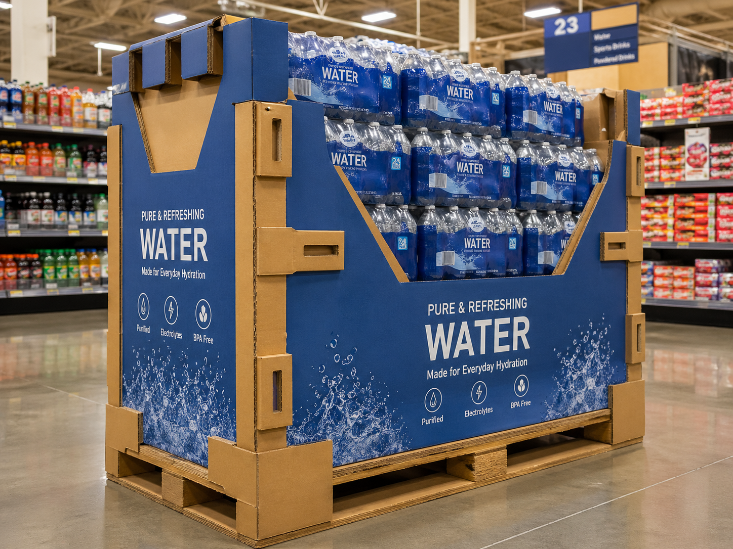
You should use your brand's colors in a bold way, with high-contrast graphics and a clear message. Make sure your logo is easy to see. The shape of the display can also be unique. This helps it stand out from the normal shelves.

When a customer walks down an aisle, you have only a few seconds to get their attention. The visual design of your display is your first and best tool. I always tell my clients to think of it as a billboard, but one that customers can touch. Every element has to work together to stop them in their tracks.
Making a Strong First Impression
The first goal is to be seen. A designer like Peter knows that balancing creativity with a client’s budget is key. But some things are non-negotiable for a successful design.
- Color Psychology: Colors send a message. Red can mean excitement or a sale. Green can suggest natural or eco-friendly. I once worked with a new snack brand. Their packaging was dark blue. We created a bright yellow display to contrast with it. The display was like a beacon in the snack aisle. It drew people in, and their sales took off.
- Clear Messaging: Keep words to a minimum. Use powerful, simple phrases like "New," "Try Me," or "Limited Time Offer." The font must be big and easy to read from a distance. A confused mind never buys. Your message should be understood in a single glance.
Structure Defines the Look
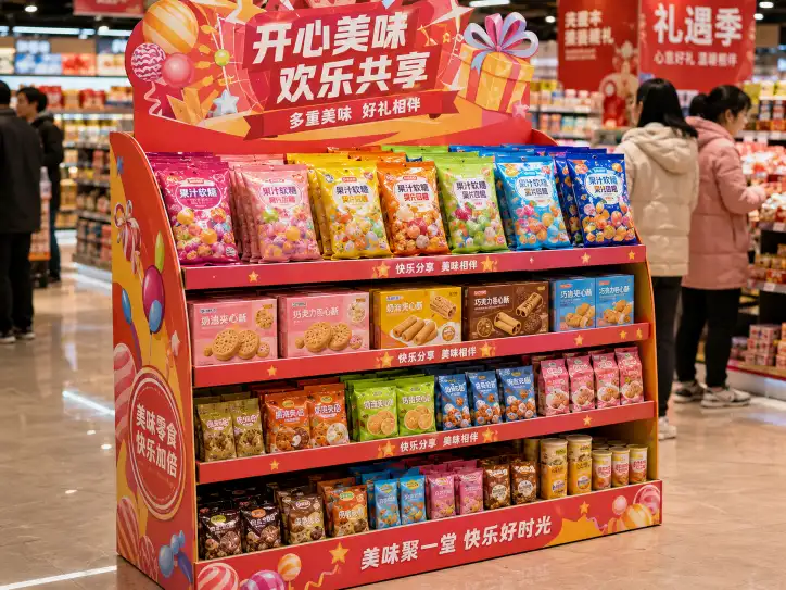
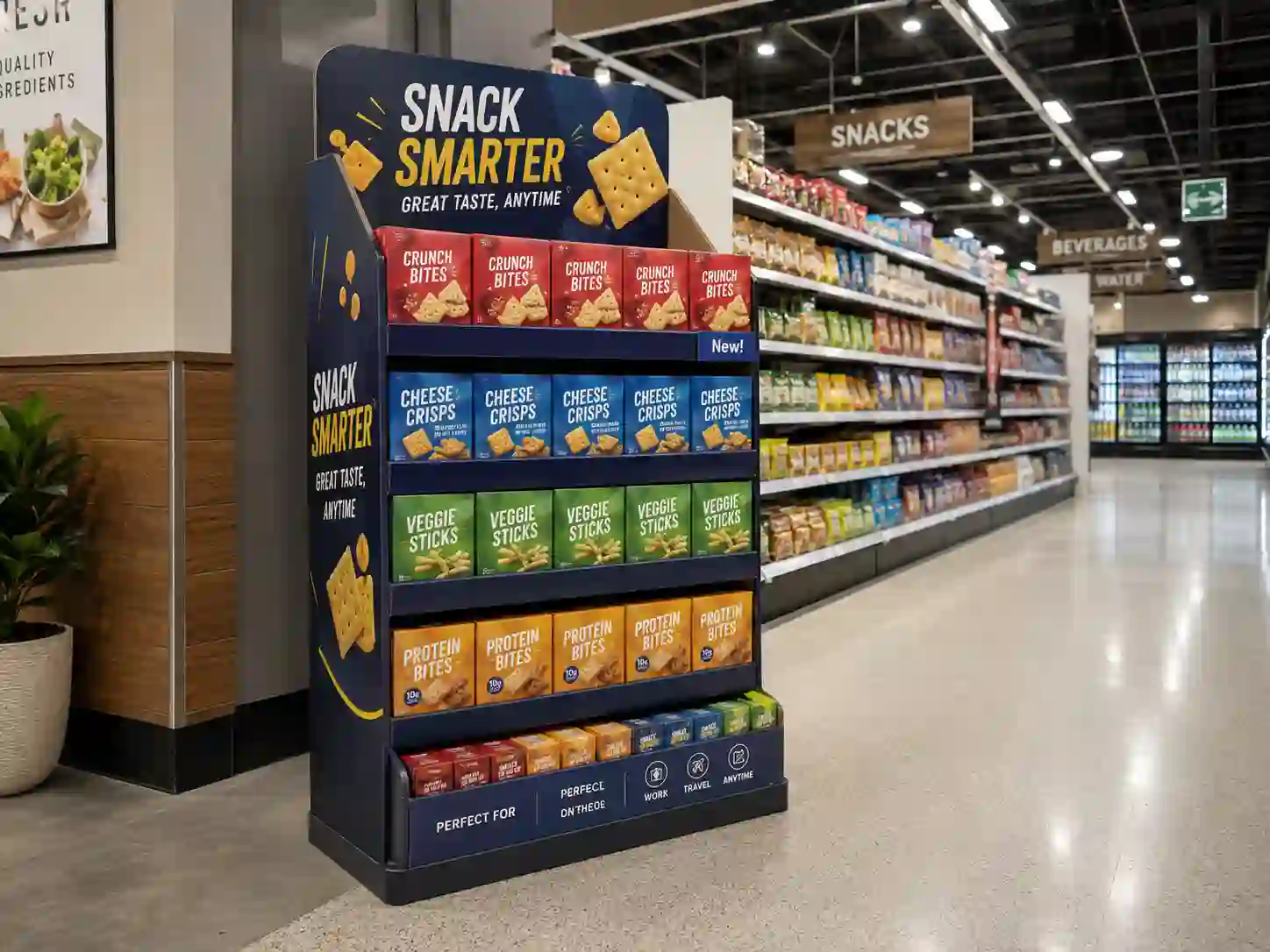
The shape of the display itself is a major part of the visual design. A standard box is fine, but it might not get a second look.
| Design Element | Why It Works | Practical Tip |
|---|---|---|
| Unique Shape | It breaks the visual pattern of the aisle, creating interest. | Design a display shaped like your product, such as a large bottle or a fruit. |
| Tiered Shelves | It presents the product at different eye levels and angles. | Use angled shelves so the product labels are easier for customers to read. |
| Header Card | This is the main billboard space for your logo and key message. | Make the header card big and bold. It should be the first thing people see. |
I remember a project for a toy company. We designed a display that looked like a castle. It cost a bit more to produce, but it created a destination for kids in the store. The engagement was incredible. The structure told a story before the customer even picked up the product. That's the power of good design.
Where is the best place to put a cardboard display in a store?
You've got a fantastic display, but is it in the right place? Poor placement means you lose sales. Putting your display in a smart spot ensures more people see it.
Place your displays in high-traffic areas for the best results. Put them near store entrances, at the end of aisles, which are called endcaps, or close to the checkout counters. Also, consider placing them next to products that go well with yours.

I've learned over the years that even the most brilliant display design will fail if no one sees it. Location is everything in retail. You need to work with the store managers to get your display into what I call the "golden zones." These are the spots where a customer's eyes and feet naturally go. Fighting for these spots is worth the effort because the sales lift can be huge.
Identifying the Retail "Golden Zones"
Every store has hotspots where sales are more likely to happen. Your job is to get your product into one of them. The store is a battlefield for attention, and these are the key strategic positions.
- The Entrance: This is your first chance to make an impression. A display here greets every customer who walks in. It’s perfect for new products or big seasonal promotions.
- Endcaps: These are the shelves at the end of the aisles. They are retail gold. Shoppers see them as they turn from one main aisle to the next. They often signal deals or popular items, so customers are already conditioned to look here.
- Checkout Counters: This is where impulse buys happen. Shoppers are waiting in line and are more likely to grab a small item. These displays, often called Counter Display Units (CDUs), are perfect for candy, batteries, or other small products.
The Power of Cross-Merchandising
One of the most effective but often overlooked strategies is placing your product next to a related one. This is called cross-merchandising. It puts your product in the customer’s mind when they are already in a buying mood for something similar. I worked on a project for a brand of gourmet crackers. They were always placed in the cracker aisle, with average sales. I suggested we create a small display to be placed in the deli department, right next to the fancy cheeses. It was a simple change. Sales went up by over 200%. The context made the sale. Think about how customers shop for and use your product, and find a companion product to pair it with.
| Placement Strategy | Best For | Potential Challenge |
|---|---|---|
| Entrance | New product launches, seasonal items | Space can be cluttered and competitive. |
| Endcap | Best-sellers, major promotions | Very high demand; may cost extra. |
| Checkout Counter | Small impulse-buy items | Limited space for product and branding. |
| Cross-Merchandising | Products used together (e.g., chips and salsa) | Requires coordination with store management. |
How can you make cardboard displays interactive to increase brand engagement?
Do shoppers just walk by your display? A static display can be boring. Adding simple interactive parts can stop customers and create a brand experience they will remember.
You can make displays interactive with QR codes that link to videos or special discounts. You can also add "lift-to-reveal" flaps, holders for free samples, or even small digital screens that play a video ad on a loop.

In today’s world, people are used to interacting with screens and technology. Bringing a piece of that into the store can make a big difference. I’ve seen that when customers can physically engage with a display—even in a small way—they are more likely to remember the product and make a purchase. The key is to keep it simple and intuitive. You're not building a complex machine; you're just adding a fun element that draws people closer to your brand.
Bridging the Physical and Digital Worlds
QR codes are a simple and cheap way to make your display interactive. A customer can scan it with their phone and be taken anywhere you want. It connects your physical display to your online world.
- Product Demos: Link a QR code to a short video showing how to use your product. This is great for new or complex items.
- Exclusive Discounts: Offer a special coupon code only available by scanning the display. This creates a sense of urgency and rewards the customer.
- Contests and Giveaways: Ask customers to scan the code to enter a contest. This is a great way to collect email addresses for your marketing list.
We once designed a display for a new cosmetic brand. We added a QR code that linked to an augmented reality filter. Shoppers could "try on" different lipstick shades using their phone's camera. It was fun, engaging, and drove incredible sales because it removed the risk of buying the wrong color.
Simple Physical Interactions
You don't always need technology to be interactive. Sometimes, the simplest ideas are the most effective. As a designer, Peter would appreciate how these low-cost additions can add a lot of value.
| Interaction Type | How It Works | Customer Benefit |
|---|---|---|
| Take-One Pocket | A small pocket holds brochures, recipes, or information sheets. | Provides helpful information they can take with them. |
| Lift-and-Reveal Flap | A customer lifts a flap to see a hidden message, a joke, or a fact. | Creates a moment of discovery and fun. |
| Product Sampler | A built-in dispenser offers a free sample of the product. | Allows customers to try before they buy, reducing purchase anxiety. |
These simple physical elements invite the customer to touch and play with the display. This small act can be enough to turn a passive looker into an active buyer. It makes the shopping experience more enjoyable and your brand more memorable.
Conclusion
A well-designed, smartly placed cardboard display is more than just a product holder. It is a powerful tool that sells your brand and engages customers right at the store.