Your product is great, but it's getting lost on crowded shelves. This means you're losing sales to competitors who stand out more, hurting your brand's growth and potential.
Custom displays are the most direct way to improve visual merchandising and boost brand visibility. They create a dedicated, branded space on the retail floor that grabs attention, tells your product's story, and separates you from the competition, making your brand memorable and easy to find.
![]()
The basic idea is simple: a custom display makes you stand out. But turning that simple idea into real sales requires a deeper understanding of what makes a display truly effective. Over my 16 years in this business, I've seen firsthand how specific choices in design and placement can make or break a campaign. It’s not just about building a stand; it’s about building a customer magnet. Let's dig into the details of how to get it right.
What's the key to making a merchandise display visually appealing?
You've created a display, but it feels bland or messy. A display that doesn't grab attention is a wasted investment and can even make your product look cheap.
The secret to a visually appealing display is harmony. This is achieved through a mix of balance, a clear focal point, and smart color choices. The goal is to guide the shopper's eye directly to the product, making it the undeniable star of the show.

Making something "look good" seems subjective, but in display design, there are principles that work every time. It's less about my personal taste and more about understanding how the human eye processes information. When my team and I start a new design, we don't just think about what's flashy; we think about what's clear. I remember a client with a health snack. Their first idea was to fill the display with tons of text about benefits. It just looked cluttered. We stripped it all back and focused on one large, beautiful image of fresh ingredients. That became the visual anchor, and sales took off. Simplicity is often the most powerful tool.
Creating Focus and Balance
Your display needs a hero. This is usually the product itself or a large, compelling image. Everything else on the display should support that hero, not compete with it. Use the 'Rule of Three'—arranging products in small groups of three can create a sense of balance and order that is naturally pleasing to the eye.
Using Color to Tell a Story
Color isn't just for decoration; it's for communication. It triggers emotions and associations faster than words.
| Color | Common Association | Best Use Case |
|---|---|---|
| Red | Excitement, Urgency | Sales, Clearances, Impulse Buys |
| Blue | Trust, Calm, Dependability | Tech Gadgets, Health Products |
| Green | Nature, Health, Freshness | Organic Foods, Eco-Friendly Items |
| Black | Luxury, Sophistication | Premium Cosmetics, High-End Products |
Choosing the right colors can instantly tell a customer what your brand is all about before they even read a single word.
When arranging merchandise, where would you display items for high visibility?
You could have the world's best display, but if it's hidden in a low-traffic corner of the store, it has failed. Poor placement means no one sees it.
For the highest visibility, place your display at eye-level on an endcap at the end of an aisle. Other key spots are checkout counters for impulse buys and main walkways, also known as "power alleys," where every shopper has to pass.

Location is everything. Thinking about the customer's journey through the store is just as important as designing the display itself. Where do they look? Where do they slow down? Where are they in a mindset to discover something new? Answering these questions is critical. Years ago, we designed a fantastic floor display for a new soft drink. It was big, bright, and beautiful. The retailer put it in the middle of the beverage aisle. It did okay. For the next order, we begged them to put it on the endcap facing the main entrance. Sales tripled. The design didn't change, but the location unlocked its full potential.
The Hot Zones in Retail
Not all floor space is created equal. As a designer, you need to know which spots give your work the best chance to succeed.
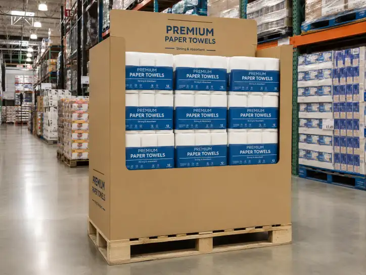
- Endcaps1: These are the most valuable pieces of real estate in a store. They face the main aisles and are seen by almost everyone. They are perfect for new product launches or major promotions.
- Eye-Level Zone2: We call this the "buy zone." It's the shelf space that sits directly in a customer's line of sight, roughly 1.2 to 1.5 meters from the floor. Products placed here are seen more, and they sell more.
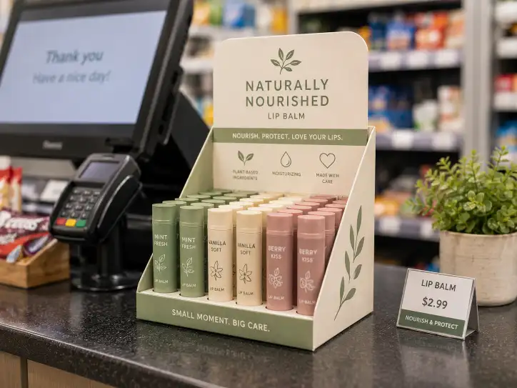
- Checkout Counters3: This is the home of the impulse buy. Customers are waiting and are easily tempted by small, affordable items. Small counter displays work wonders here.
Matching the Display to the Location
The type of display you design should match where it's going to be placed.
| Location | Purpose | Best Display Type |
|---|---|---|
| Endcap | Maximum Impact / Product Launch | Large Floor Display, Pallet Display |
| Checkout Counter | Impulse Purchase4 | Small Counter Display (PDQ) |
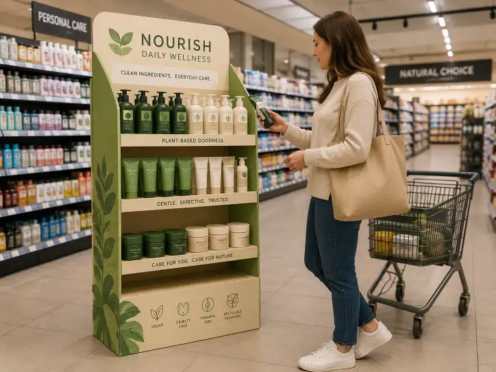
| In-Aisle | Brand Reinforcement / Information | Shelf Talker, Small In-Shelf Display |
| Entrance | Create a "Wow" Moment | Theatrical or Interactive Display |
What is display in visual merchandising?
Many people think a display just holds products. This limited view leads to boring, ineffective designs that don't do anything to help sell the product.
In visual merchandising, a display is a silent salesperson. It’s a strategic, three-dimensional arrangement designed to attract, inform, and persuade a customer to buy. It's not just a shelf; it's a communication tool that tells a brand's story.

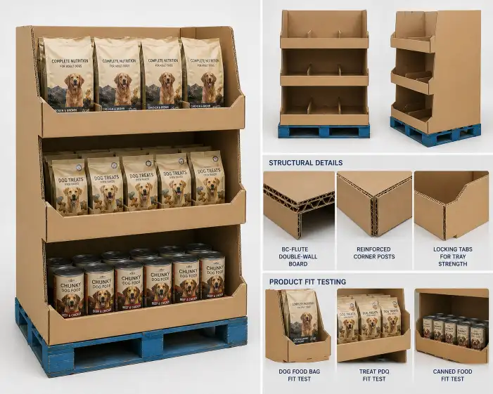
I've always told my team and our clients to stop thinking of displays as furniture. Think of them as your best salesperson, one that works 24/7 without a break. It can't speak, so it has to communicate visually. What does it say about the product? Is it fun? Is it serious? Is it a luxury item or a bargain? The materials, shape, colors, and graphics all work together to create a personality. We once worked with a company selling premium dog treats. Instead of a basic box display, we designed it to look like a little dog house. It was a simple idea, but it instantly communicated "a special treat for a beloved pet." That emotional connection is what turns a browser into a buyer.
The Display as a Storyteller
Every product has a story. Is it made with natural ingredients? Is it the latest technology? Is it a fun treat for the family? A great display tells that story in about three seconds.
- For an organic soap brand: We might use raw, unfinished cardboard textures and green and brown colors to tell a story of "natural" and "eco-friendly."
- For a new video game: We might use sleek, angled lines, dark colors, and a spot for a screen to tell a story of "high-tech" and "excitement."
The display gives context and adds value before the customer even touches the product.
Functional vs. Theatrical Displays5
Not all displays have the same job. It's important to understand the difference.
- Functional Displays6: These are the workhorses. Their main job is to hold products neatly and make shopping easy. A standard PDQ (Product Display Quickly) on a shelf is a good example.
- Theatrical Displays5: These are the showstoppers. Their main job is to create an experience and generate buzz. Think of a giant car made of soda cans or an interactive station. They might not hold a lot of product, but they attract a lot of attention. A good merchandising plan often uses both.
How do displays attract customers?
Customers are on autopilot in a store, walking past thousands of items. If you don't break their routine, your product will never even be seen by them.
Displays attract customers by being different. They use bold graphics, unique structures, and simple, powerful words to break the visual pattern of the store aisle, creating a point of interest that makes a customer stop and look.
![]()
The key to attraction is disruption. A retail aisle is a very repetitive environment: long, straight lines of shelving. Anything that breaks that pattern—a different shape, a bold color, a surprising image—will naturally draw the eye. Many years ago, a chip company wanted a new display. The snack aisle was a rainbow of bright bags. Doing another bright red or yellow display would have just blended in. Instead, we designed a display that looked like a rustic wooden barrel. It was completely different from everything around it. It didn't shout, but it stood out because it was unexpected. That's how you get a customer to turn their head.
The Psychology of Attraction7
Getting that first glance is a science. We use a few key psychological triggers to make people look.
- Pattern Interruption8: As I mentioned, breaking the "sea of sameness" is the most powerful tool. A round display in a world of square shelves will always get noticed.
- The Power of Faces: The human brain is hardwired to notice faces. Using large, high-quality photos of people (or even animals) on your display is a nearly guaranteed way to get attention.
- Communicating Value Instantly: People are always looking for a good deal. Words like "New," "Sale," "Save," or "Free Gift" are incredibly powerful. They should be big, bold, and easy to read from a distance.
Using Elements to Grab Attention
Here's how different elements contribute to attracting a customer.
| Element | Psychological Impact | How to Use It |
|---|---|---|
| Color9 | Creates Emotion | Use a bold, contrasting color that stands out from the store shelves and competitor packaging. |
| Shape10 | Sparks Curiosity | Design a structure that is not a simple box. Curves, angles, or a unique silhouette make people look twice. |
| Text11 | Creates Urgency | Use very few words. Focus on a single, powerful message that communicates a clear benefit (e.g., "50% More Free"). |
Conclusion
Custom displays are vital for your brand. They make you visible by creating an appealing, well-placed, and attractive focal point that tells your story and drives sales effectively.
-
Endcaps are prime retail real estate, perfect for maximizing visibility and driving sales for new products. ↩
-
The eye-level zone is crucial for visibility, as products placed here are more likely to be seen and purchased. ↩
-
Checkout counters are strategic spots for impulse buys, making them essential for increasing sales of small items. ↩
-
Understanding impulse purchase strategies can help retailers optimize their checkout displays for maximum sales. ↩
-
Theatrical displays create memorable experiences that generate buzz and draw attention, essential for brand engagement. ↩ ↩
-
Functional displays are designed to hold products neatly, making shopping easier and enhancing customer experience. ↩
-
Understanding psychological triggers can enhance display effectiveness, making products more appealing to shoppers. ↩
-
Pattern interruption is a powerful technique that breaks visual monotony, capturing customer attention effectively. ↩
-
Color creates emotion and can significantly influence customer behavior, making it a vital element in display design. ↩
-
Unique shapes spark curiosity and can make displays stand out, drawing customers' attention in a crowded environment. ↩
-
Effective text creates urgency and communicates value, making it essential for capturing customer interest quickly. ↩