Are your retail displays failing to grab attention? It's frustrating when great products go unnoticed, all because the colors on your display aren't making an impact on shoppers.
Color psychology in retail is the strategic use of colors to influence a shopper's feelings, perceptions, and buying decisions. The right color can attract attention, communicate a brand's message, and guide a customer toward making a purchase, making it a powerful tool for increasing sales.

I've been in the cardboard display industry for 16 years, and I've seen firsthand how a simple color change can transform a failing campaign into a massive success. It's not magic; it's about understanding how the human brain reacts to different colors. This isn't just theory for designers; it's practical knowledge that directly impacts your bottom line. If you want to stop guessing and start designing displays that sell, you need to understand the 'why' behind color choices. Let's break down how this works.
What is the psychology of colors in retail?
Choosing display colors often feels like pure guesswork. A wrong guess can make your product completely invisible to shoppers, costing you sales and visibility on a crowded retail floor.
The psychology of colors in retail is the science of how different hues affect customer perceptions1 and behaviors. It directly influences emotions, creates strong brand associations2, and is often the final nudge that convinces a customer to buy your product instead of a competitor's.

In my experience, this isn't about simply picking a "pretty" color. It's a calculated decision. The core idea is that colors trigger specific responses. For example, a bright yellow might catch a shopper's eye from across the store, while a deep blue instills a sense of trust and quality for a high-tech gadget3. I remember a client who initially wanted a calm, pastel green for an energy drink promotion. The idea was to look "healthy." But it didn't work. Shoppers walked right by it. We redesigned the display using a vibrant, energetic orange and red. Sales immediately jumped by over 30%. That's the power of retail color psychology in action. It’s about matching the product’s function and the brand’s personality with the emotional trigger of the color4 to create a display that doesn't just sit there but actively communicates with the customer.
What is the psychology behind colors?
You probably know that colors have certain meanings. But not knowing the deep-seated reasons why can lead to ineffective or even culturally insensitive designs, a costly mistake for any brand.
The psychology behind colors comes from a mix of biological responses, learned cultural associations5, and unique personal experiences. Our brains are hardwired to react to color; it’s a primal form of communication that has guided human survival, choice, and emotion for thousands of years.

Let's dive deeper into this. At its most basic level, our reaction to color is evolutionary. Red often signals ripeness in fruit or danger in blood or fire, triggering alertness. Green signals nature, life, and safety, a place to find food and shelter. Blue represents the vastness of the sky and water, which often has a calming effect. These are almost universal biological responses.
Then you add the layer of culture. In Western cultures, white symbolizes purity and is used for weddings. In many Eastern cultures, however, white is the color of mourning. I learned this the hard way years ago. We designed a beautiful white display for a product launch in an Asian market, thinking it looked clean and modern. Our local partner quickly informed us of the cultural meaning, and we had to pivot to red, which signifies luck and happiness there. This experience taught me that a designer must consider not just the product but also the specific market it's going into.
What do colors mean in retail?
Just picking a color you personally like isn't a strategy. A poor color choice can send the wrong message, making a luxury product6 feel cheap or a fun product seem boring.
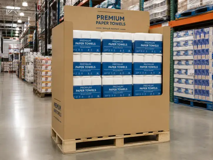
In a retail setting, colors work as a quick, non-verbal language. Red often screams "sale" or "urgency." Blue builds trust and a sense of security. Green suggests a product is natural or healthy. Black communicates luxury and sophistication. Each color sends a clear signal to the shopper.

Over my 16 years of designing displays, I've developed a practical guide for my clients. It's about using these color signals intentionally to position a product correctly in the customer's mind. For designers like Peter, understanding this "language" is essential for creating effective packaging and displays. Here’s a simple breakdown of how I see these colors working on the shop floor.
| Color | Psychological Meaning | Common Retail Application | My Experience and Tips |
|---|---|---|---|
| Red | Urgency, Excitement, Passion | Clearance racks, fast food, impulse buys (e.g., candy at checkout) | Use it strategically to draw the eye. Too much red can feel aggressive or stressful. It's perfect for a "Limited Time Offer" sign. |
| Blue | Trust, Security, Dependability | Banks, tech companies (like Dell or Intel), men's grooming products | Excellent for items that require customer trust, such as electronics or financial services. A calm, authoritative color. |
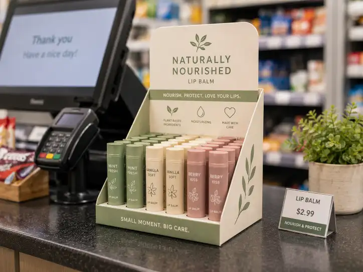
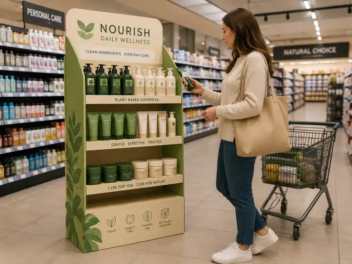
| Green | Health, Nature, Freshness, Wealth | Organic foods, eco-friendly products, health supplements, financial institutions | The shade is critical. Bright lime green feels energetic. Dark forest green feels prestigious and natural. A go-to for anything "good for you." |
| Yellow | Optimism, Youth, Attention-Grabbing | Window displays, sale signs, brands targeting young people | It’s highly visible and great for catching attention from a distance. However, use it with care, as too much can cause eye fatigue. |
| Orange | Friendliness, Confidence, Action | Call-to-action buttons ("Buy Now"), sports teams, creative brands | It’s a fantastic, friendly alternative to red. It has high energy without the alarming feel of red. I use it to encourage a purchase. |
| Black | Luxury, Power, Sophistication | High-end fashion, premium cosmetics, luxury tech gadgets | Nothing says "premium" like black. It makes other colors, especially metallics, pop. It creates a feeling of exclusivity and high value. |
| White | Cleanliness, Simplicity, Modernity | Apple products, healthcare, minimalist brands, cleaning supplies | White creates a sense of space and lets the product be the hero. It communicates honesty and clarity. Great for tech and health products. |
What is the color theory of visual merchandising7?
You know individual colors have meaning, but how do you combine them? A poor color combination can look cheap, chaotic, or confusing, undermining the brand's entire message.
The color theory of visual merchandising7 is about using the color wheel8 to build combinations that are visually appealing and psychologically effective. It involves using schemes like analogous, complementary, or triadic colors9 to create harmony, contrast, and a clear visual path for the shopper.

This is where the art meets the science. For designers, mastering a few basic principles is more important than knowing every possible combination. In my work, I constantly rely on three core strategies to create displays that look professional and guide the customer's eye exactly where my client wants it to go. I also use a simple rule to keep the design balanced.
Analogous Colors
These are colors that sit right next to each other on the color wheel8, like blue, blue-green, and green. This combination creates a very calm and comfortable feeling. It feels harmonious and pleasing to the eye. We use this scheme for brands that want to project a sense of peace and wellness, like a display for spa products or organic teas. It’s not jarring, so it allows the customer to comfortably absorb the product information.
Complementary Colors
These colors are direct opposites on the color wheel8, like red and green or blue and orange. This pairing creates the highest possible contrast and visual excitement. If a client tells me, "I need this display to jump off the shelf," this is the first strategy I consider. It's perfect for sales promotions, new product launches, or any situation where grabbing immediate attention is the number one goal.
Triadic Colors
This involves choosing three colors that are evenly spaced on the color wheel8, such as the primary colors red, yellow, and blue. This scheme is vibrant and dynamic while remaining balanced. It offers high contrast but with more variety than a complementary scheme. It's a great choice for brands with a playful or energetic personality, like displays for children's toys or a fun snack food.
Finally, a pro tip I always share is the 60-30-10 Rule10. Use a dominant color for 60% of your display, a secondary color for 30%, and a punchy accent color for the final 10%. This creates a balanced, professional look every time.
Conclusion
Choosing the right color is not just an artistic choice; it's a science. Understanding this psychology gives your products the best chance to connect with customers and drive sales.
-
Discover the impact of color on customer perceptions and buying decisions. ↩
-
Understand the role of colors in building strong brand associations. ↩
-
Explore color choices that enhance the appeal of high-tech products. ↩
-
Understand how colors can evoke emotions and influence purchasing behavior. ↩
-
Explore how cultural meanings of colors can affect marketing strategies. ↩
-
Understand which colors effectively communicate luxury and sophistication. ↩
-
Learn about visual merchandising techniques that enhance product visibility. ↩ ↩
-
Learn how to effectively use a color wheel for creating color schemes. ↩ ↩ ↩ ↩
-
Explore the use of triadic colors for vibrant and balanced designs. ↩
-
Discover how the 60-30-10 Rule can create visually appealing displays. ↩